
CompTIA
An editorial answer to a technical category.
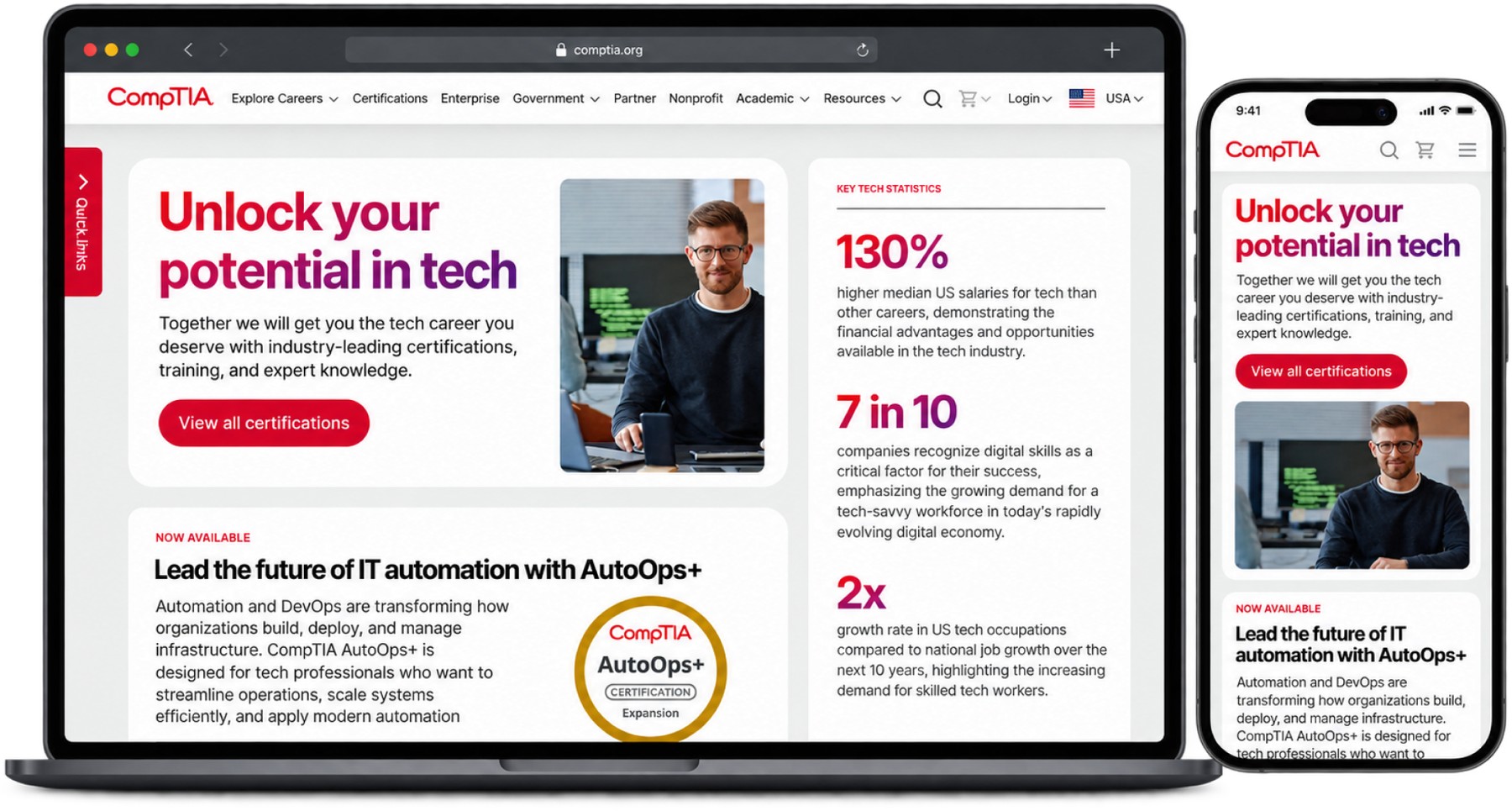
- Problem
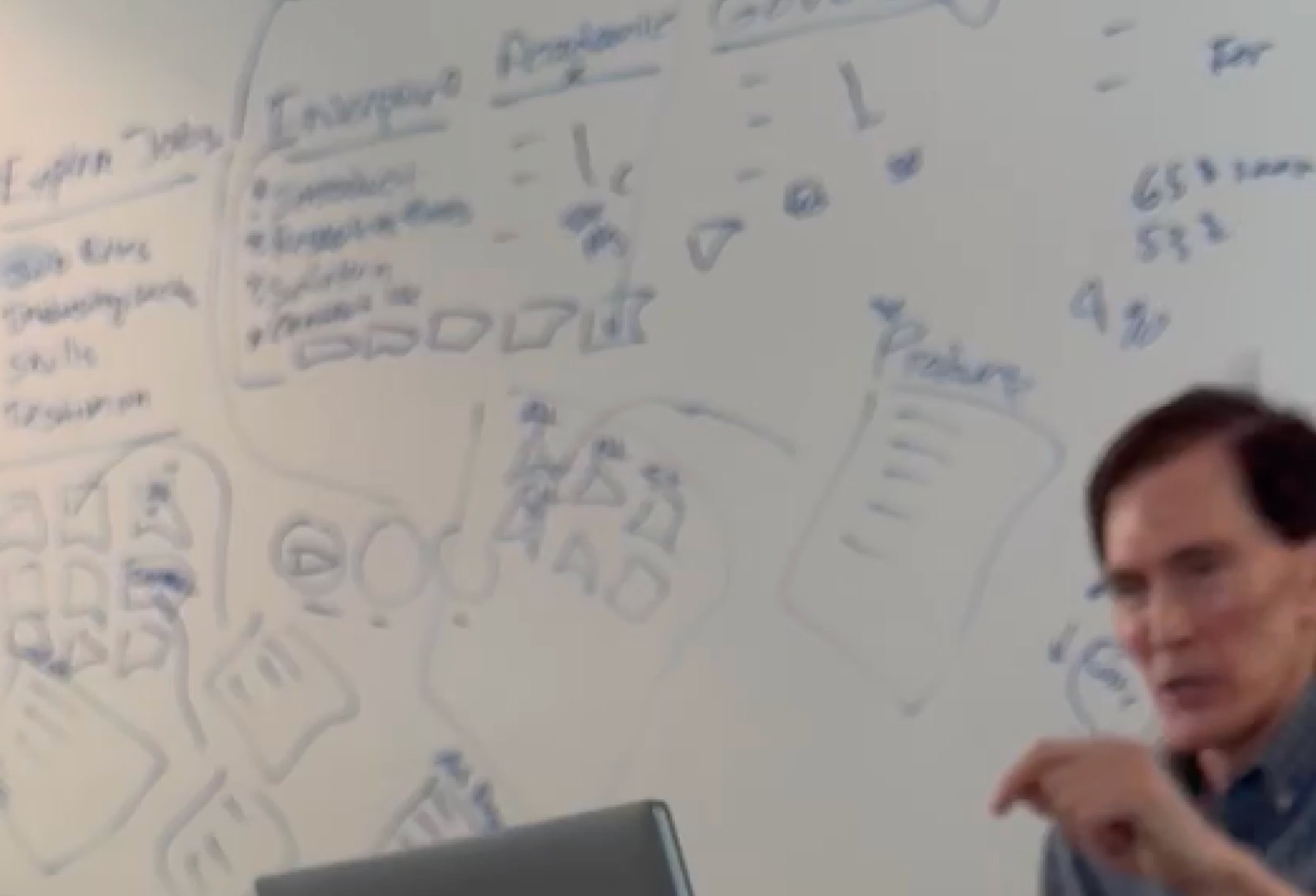
- A learning platform transformation had stalled. The CEO’s vision for it existed on a whiteboard and challenged the direction the previous design team had taken.
- My role
- Design Director. We joined as a development partner; as the design problems surfaced I embedded with CompTIA’s team, then we took over the design work entirely.
- Key decisions
- Commit to an editorial direction that broke with the conventions of IT certification, and turn the CEO’s instinct into something concrete, defensible and buildable rather than a mood.
- Result
- A live digital experience that helps students access CompTIA’s services and earn IT certifications, carried by a design system the development team could build against.
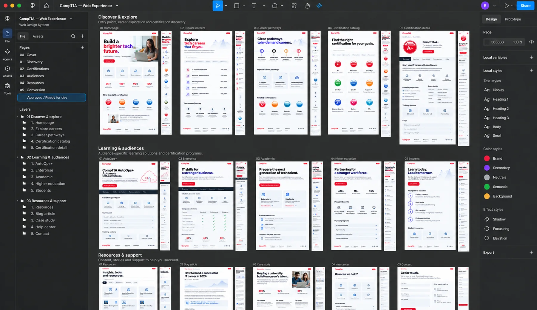
- 22components in the design system
- 10–12page templates
- Livein production
Overview
CompTIA is a large-scale learning platform transformation, rescued mid-flight and rebuilt around an editorial direction that broke from every convention in IT certification. The CEO had a clear vision that challenged the direction of the previous design team. We were brought in to decipher that vision, translate it into a cohesive experience, and bring it to life.
The challenge
A stalled transformation, and a vision that only existed on a whiteboard.
We joined as a development partner. As the design problems surfaced, I embedded with CompTIA’s team, then we took over the design work entirely.
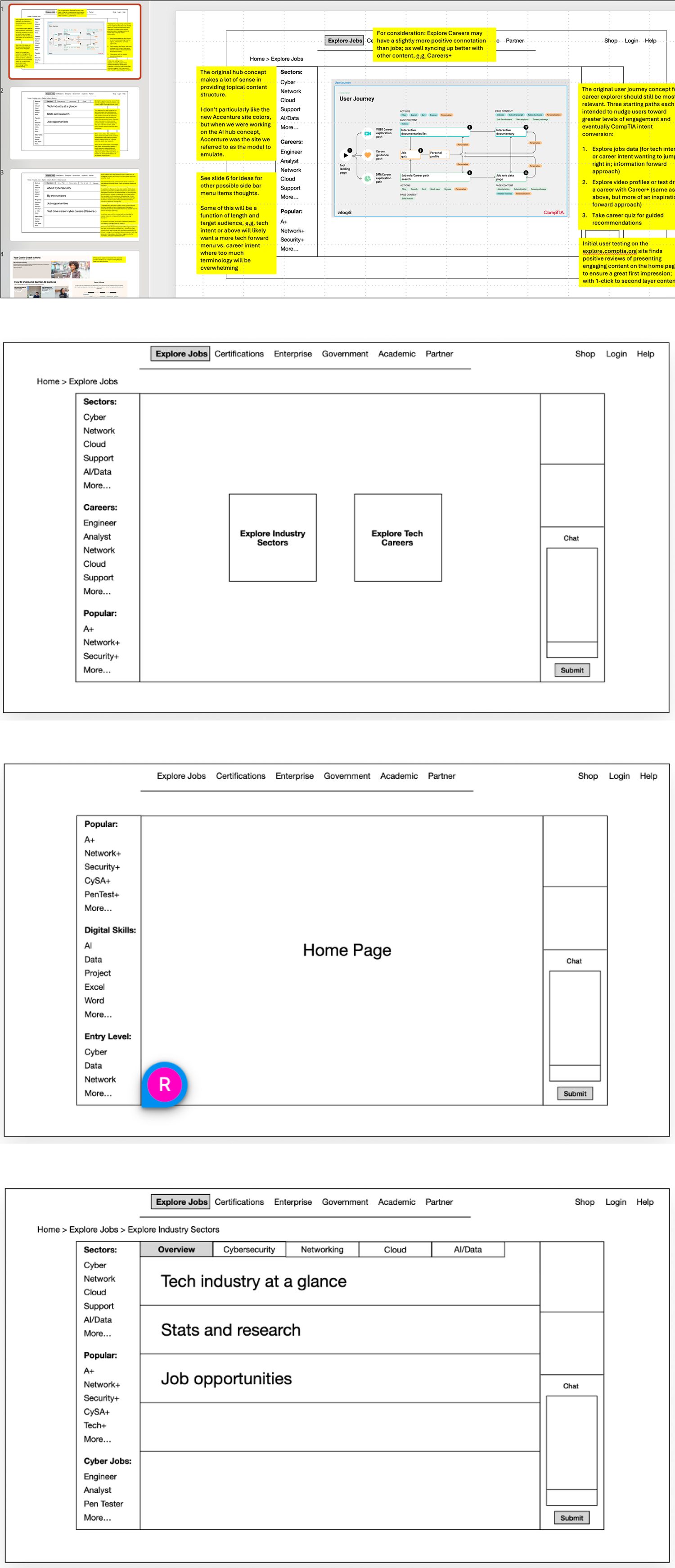
Interpreting the vision
Turning sketches into a direction the whole team could build against.
The CEO had a clear instinct for what the experience should feel like. Our job was to make it concrete, defensible and buildable.
What I led
- Executive translation. Worked directly from the CEO’s sketches and intent, and turned them into a direction the whole team could argue with and build against.
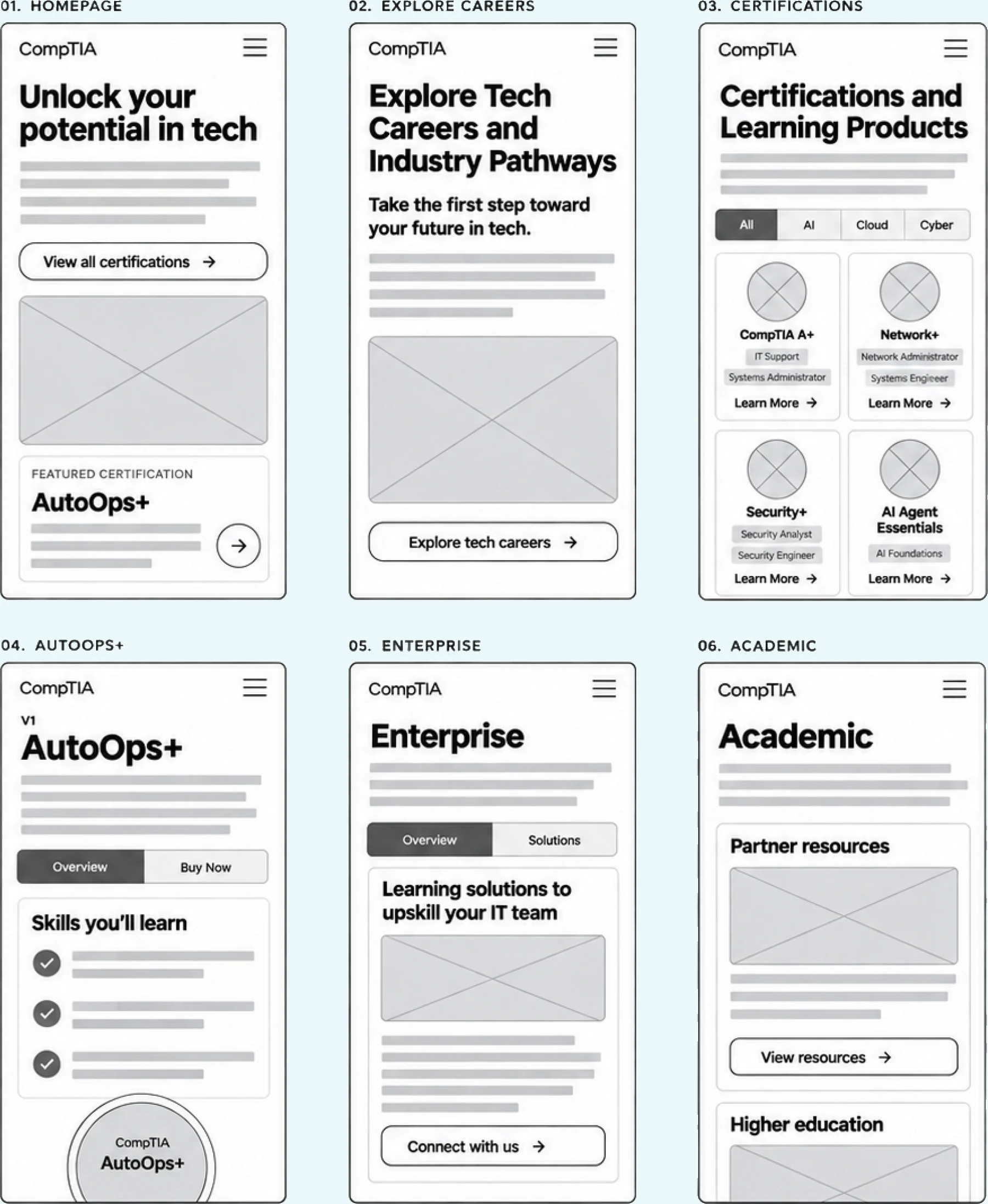
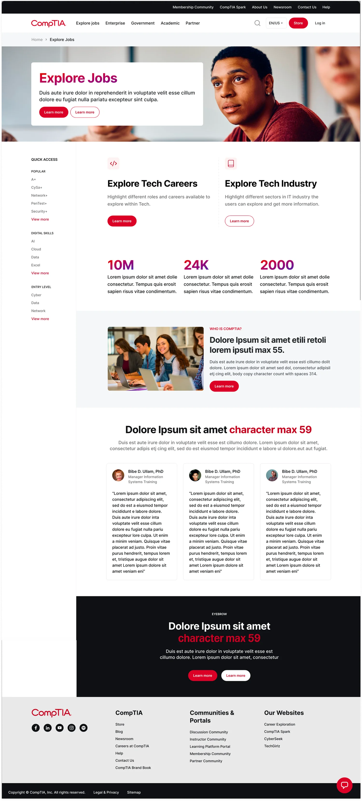
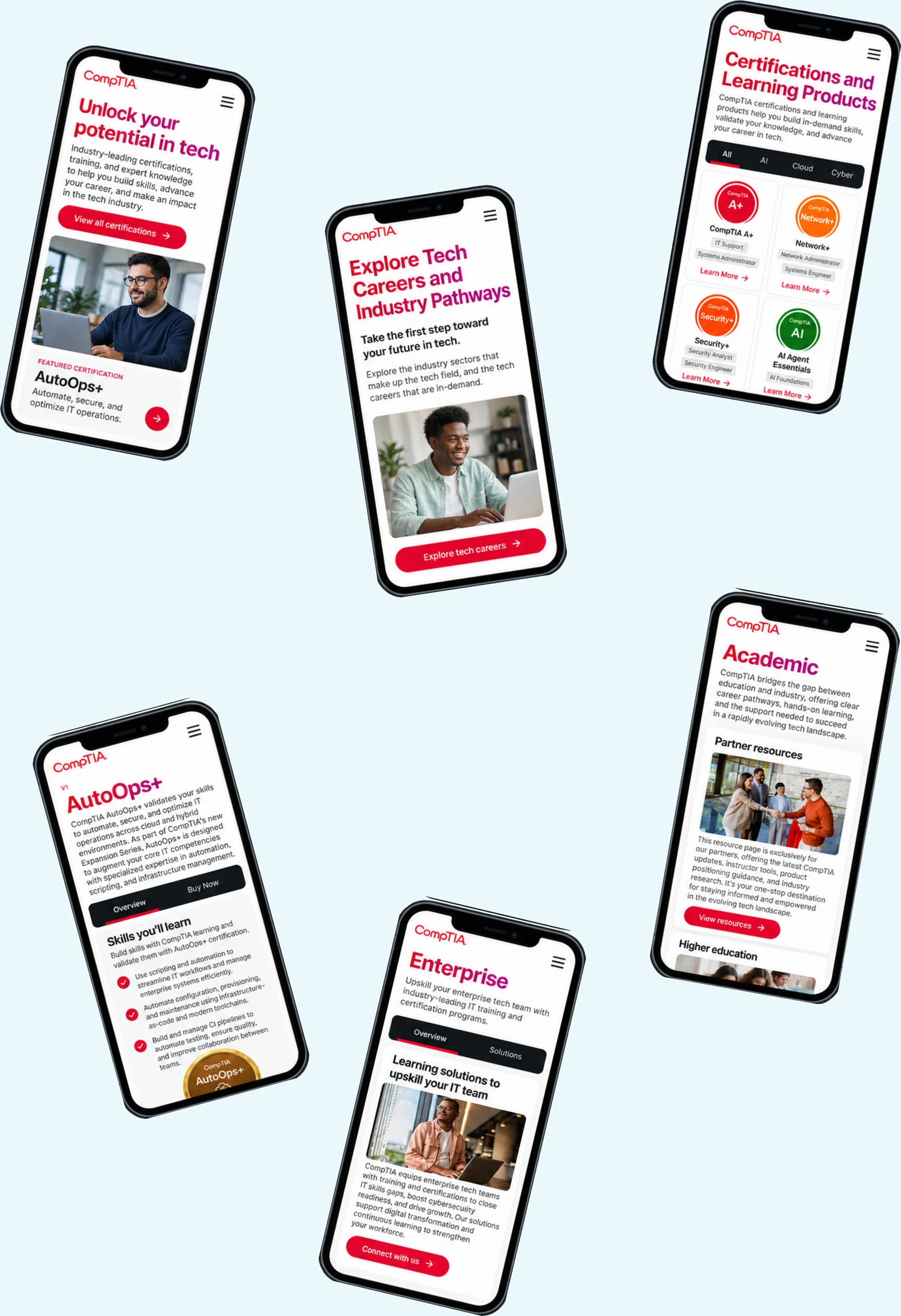
- Design direction. Set the editorial visual language and held it across the homepage, Explore Careers, certifications, AutoOps+, enterprise and academic.
- Information architecture. Restructured the certification and careers content so a student could find a path rather than a catalogue.
- Design system. Built the component set and page templates that let the work scale past the screens we designed.
- Delivery alignment. Embedded with CompTIA’s team and worked to development-ready, approved files rather than handing over mockups.
The outcome
We quickly translated CEO Todd Thibodeaux’s vision into a live digital experience that helps thousands of students access CompTIA’s services and earn IT certifications.
Next project
MAC Cosmetics
A concept store where picking up a lipstick changed the mirror in front of you.